PlotsOfData - a web app for visualizing data together with its summaries
Posted on: 29 October 2018
Preprint posted on 27 September 2018
Article now published in PLOS Biology at http://dx.doi.org/10.1371/journal.pbio.3000202
The most important part of the scientific endeavor, after performing and analyzing experiments, is to compile and plot the results in the best possible way to visualize and share the data. In particular, plots reporting the results of scientific experiments are the foundation of research articles. As such software, which allow the generation of various type of plots, are an important part of a scientist’s toolbox.
While bar charts are relatively easy to generate and can be created using almost any spreadsheet software, these are often a poor representation of the raw data and may lead to inaccurate interpretation of the results. Therefore, alternatives such as dot plots, box plots or violin plots are routinely used either as stand-alone or in combination. However, generating these plots remains relatively difficult. Commercial plotting software are widely available but are often expensive and constitute a financial burden for academic labs and students alike. Free alternatives exist but mostly require coding knowledge (i.e., R language). To fill these gaps, multiple online tools are now becoming available to easily generate advanced plots and statistical analyses including the very popular boxplotr (Spitzer et al., 2014; http://shiny.chemgrid.org/boxplotr/)
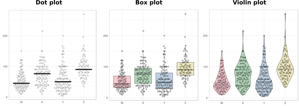
In the subject of this prelight, Marten Postma and Joachim Goedhart follow in the footsteps of boxplotr, and report the creation of an online tool, PlotsOfData, which allows the creation of dot plots, box plots, or violin plots (Figure 1) (Postma and Goedhart, 2018). PlotsOfData (https://huygens.science.uva.nl/PlotsOfData/) is very user friendly (data can be imported directly via copy and paste), customizable (easy to modify plot parameters) and the resulting graphs can be exported as images or modifiable PDFs. PlotsOfData was written using the powerful R/shiny and implements the well-known ggplot2 package for generating plots. I have already used this tool to generate plots for my current manuscript and I am looking forward to seeing the addition of more features to this tool.

Other worthy tools, for those who are interested in web apps for advanced plotting, include:
- Raincloud plots (Allen et al., 2018), web app (https://gabrifc.shinyapps.io/raincloudplots/) and prelight (https://t.co/X8IcDFgaCa)
- PlotTwist (for time-series and other continuous data): https://huygens.science.uva.nl/PlotTwist/
- PlotsOfDifferences (https://huygens.science.uva.nl/PlotsOfDifferences/)
- Estimation Statistics (Ho et al., 2018) web app (http://www.estimationstats.com/#/)
Do you have another favorite web app for data plotting ? please add it to the comments !
References
Allen, M., D. Poggiali, K. Whitaker, T.R. Marshall, and R. Kievit. 2018. Raincloud plots: a multi-platform tool for robust data visualization. PeerJ Inc.
Ho, J., T. Tumkaya, S. Aryal, H. Choi, and A. Claridge-Chang. 2018. Moving beyond P values: Everyday data analysis with estimation plots. bioRxiv. 377978. doi:10.1101/377978.
Postma, M., and J. Goedhart. 2018. PlotsOfData – a web app for visualizing data together with its summaries. bioRxiv. 426767. doi:10.1101/426767.
Spitzer, M., J. Wildenhain, J. Rappsilber, and M. Tyers. 2014. BoxPlotR: a web tool for generation of box plots. Nat. Methods. 11:121–122. doi:10.1038/nmeth.2811.
doi: https://doi.org/10.1242/prelights.5302
Read preprint


 (3 votes)
7 years
Joachim Goedhart
Hi Guillaume,
Thanks for highlighting our preprint and web tool. Here’s another online tool to display dotplots:
http://statistika.mfub.bg.ac.rs/interactive-dotplot/
Reference
http://www.jbc.org/content/292/50/20592.full