


Raincloud plots: a multi-platform tool for robust data visualization
Posted on: 25 September 2018
Preprint posted on 23 August 2018
Categories: scientific communication and education
Background
The importance of data representation and visualisation cannot be overstated. The way in which data is represented affects how we interpret data, and thus what conclusions we draw from them. Commonly used methods of visualising data, such as bar plots and box plots, fail to adequately represent the distribution of the data. These are increasingly replaced with alternative visualisations, such as violin plots, which contain both a box plot together with the probability density function. Allen et al. introduce a new means of data visualisation, the raincloud plot, which elegantly displays probability density, raw data points and a visualisation of standard tendency (such as a box plot).
Raincloud plots
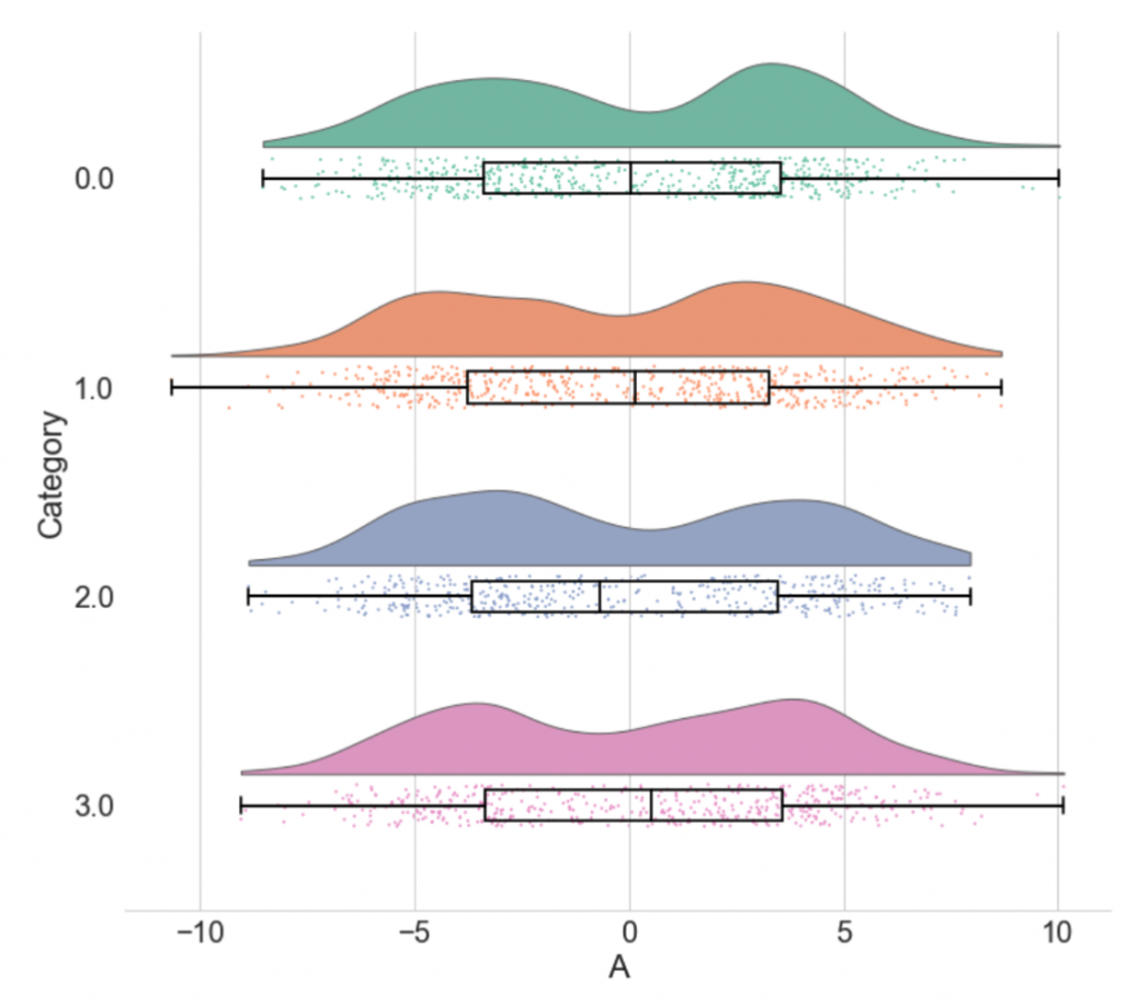
Figure 4 of the preprint: Raincloud plots
Raincloud plots immediately remind me of violin plots, as they do have the very elements that constitute a violin plot – the probability density function and the box plot. Naturally, the former is useful for clearly visualising how data is distributed, while the latter summarises important statistical information, such as the median and quartiles. However, the raincloud plot also includes raw jittered data points, which can provide important information about outliers and unexpected patterns in the data. By combining these three elements, the raincloud plot displays the data clearly.
The authors provide code, documentation and even tutorials for the creation and customisation of raincloud plots in R, Python and Matlab.
What I like about this work
Research deals with increasingly larger datasets, and clear visualisation of such data is crucial in understanding and drawing conclusions from the data. I think raincloud plots are a wonderful and strong tool for data visualisation – they are simple and elegant, and yet display a large amount of information in a non-redundant manner. I also appreciate the fact that they are flexible – different elements of the raincloud plot can be included or excluded based on the data that one has, and this is clearly outlined in the tutorial.
I am a supporter of open source and open data, and am thrilled that the code has been made available to all, with interactive tutorials provided in R and Python. It would be ideal for all papers containing statistical datasets to be accompanied by the raw data, but I see raincloud plots as a close second – the jittered raw data, in the form of ‘rain’, reveals almost everything one could have from the raw data.
Questions for the authors
- Where did the inspiration for this project come from?
- How have raincloud plots been received by the scientific community? Have many people tried it out, and what is the general feedback you’ve received?
- Do you have any thoughts on the alternatives to null hypothesis significance testing (e.g. t-tests) that could accompany your raincloud plots?
Further reading
Blogposts by the author: https://micahallen.org/2018/03/15/introducing-raincloud-plots/, https://micahallen.org/2018/08/24/raincloudplots-the-preprint/
Related preLight – Moving beyond P values: Everyday data analysis with estimation plots: https://prelights.biologists.com/highlights/moving-beyond-p-values-everyday-data-analysis-estimation-plots/
doi: https://doi.org/10.1242/prelights.4855
Read preprint (2 votes)
 Sign up to customise the site to your preferences and to receive alerts
Register hereAlso in the scientific communication and education category:
Science should be machine-readable
Theodora Stougiannou
A thirty-year trend of increasing clinical orientation at the National Institutes of Health
AND
Prediction of transformative breakthroughs in biomedical research
Jonathan Townson
DNA Specimen Preservation using DESS and DNA Extraction in Museum Collections: A Case Study Report
Daniel Fernando Reyes Enríquez, Marcus Oliveira